New! Map of NYC school utilization rates
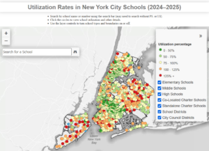
Below is a screenshot of our latest interactive webmap, which shows utilization rates at individual schools across New York City, revealing how many overcrowded schools are sitting close by underutilized schools of the same grade levels. The data is from the latest 2024-2025 Enrollment, Capacity and Utilization Report, known as the “Blue Book.”
By using the dropdown box on the upper right hand corner, you can sort by school district, Council district, and type of school. You can also zoom in or zoom out, and search for individual schools in the search bar, to display utilization, enrollment, and capacity data for each school.
Click on the map below to get to the webpage, or check out our map here.
Social Networks: